How to Create a Digital Clock in C#
By Tan Lee Published on Jul 16, 2024 16.28K
To create a digital clock using CircularProgressBar in a C# Windows Forms Application, you'll need to use the CircularProgressBar control from the CircularProgressBar NuGet package.
This control is similar to the standard ProgressBar but designed with a circular style, making it suitable for various graphical representations, including a clock.
Creating a digital clock using a circular progress bar in C# involves several steps. You'll use a timer to update the clock display and a circular progress bar to represent the passage of time.
How to use Circular Progress Bars in C#
Here's a step-by-step guide to achieve this using Windows Forms
First of all, You need to install the CircularProgressBar library by right-clicking on your project, then select Manage NuGet Packages -> Enter CircularProgressBar at the search box -> install it.
The Circular ProgressBar is a custom control for WinForm with animation.
After installing the CircularProgressBar library, you should rebuild your project, then drag the CircularProgressBar.dll in the packages directory into your Visual Studio toolbox.
How to add circular ProgressBar in C#
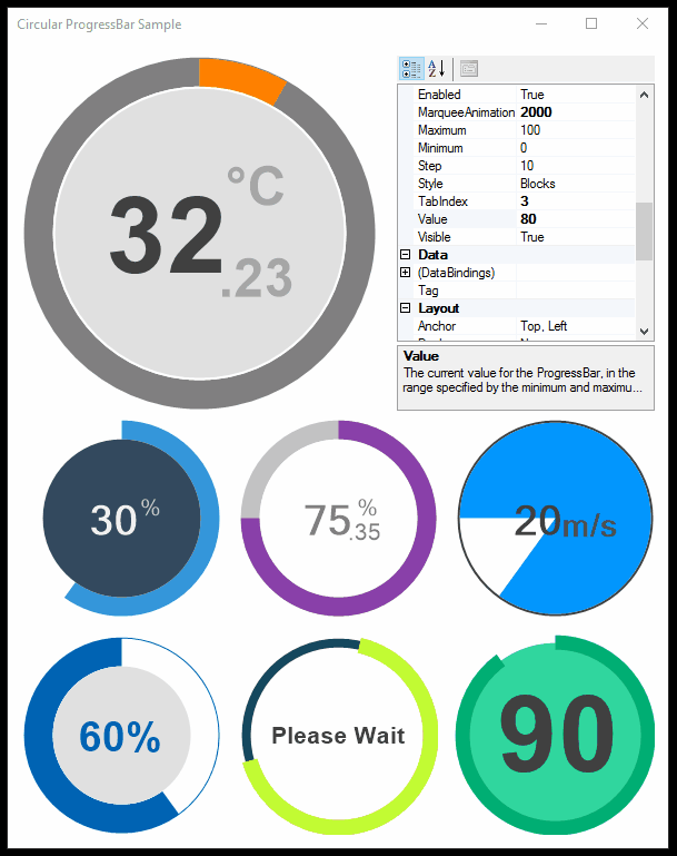
Open your form designer, then drag and drop the CircularProgressBar control from the Visual Studio toolbox into your Form. You can design a simple UI as shown below.
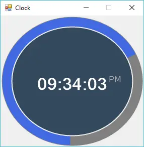
I will add a Timer control into Form to help me update the clock.
Double click on your form to handle the Form_Load event as the following c# code.
// c# timer control
private void Form1_Load(object sender, EventArgs e)
{
    System.Timers.Timer timer = new System.Timers.Timer();
    timer.Interval = 1000;//1s
    timer.Elapsed += Timer_Elapsed;
    timer.Start();
}
Double click on the Timer control to add a Timer_Elapsed event handler help you update digital click time as shown belown.
// c# circular progressbar
private void Timer_Elapsed(object sender, System.Timers.ElapsedEventArgs e)
{
    // Invoke an anonymous method on the thread of the form.
    circularProgressBar1.Invoke((MethodInvoker)delegate
    {
        //Set time to circular progressbar
        circularProgressBar1.Text = DateTime.Now.ToString("hh:mm:ss");
        circularProgressBar1.SubscriptText = DateTime.Now.ToString("tt");//AM or PM
    });
}
We will update the text property of CircularProgressBar control every second.
You can easily customize the CircularProgressBar by changing its properties in the designer or with code.
The Circular Progress Bar has the following properties:
- CircularProgressBar.Maximum: Shows and changes the maximum acceptable value for the progress bar.
- CircularProgressBar.Minimum: Shows and changes the minimum acceptable value for the progress bar.
- CircularProgressBar.Value: Shows and changes the current value of the progress bar.
- CircularProgressBar.Style: Shows and changes the style of the progress bar. Only Continues and Marquee is now supported. Blocks behaves as same as Continues.
- CircularProgressBar.BackColor: Background color of control, transparent is not supported
- CircularProgressBar.Text: Primary text
- CircularProgressBar.TextMargin: Margin of the primary text
- CircularProgressBar.Font: Font of the primary text
- CircularProgressBar.SuperscriptText: Superscript text
- CircularProgressBar.SuperscriptMargin: Margin of the superscript text
- CircularProgressBar.SuperscriptColor: Font color of the superscript text
- CircularProgressBar.SubscriptText: Subscript text
- CircularProgressBar.SubscriptMargin: Margin of the subscript text
- CircularProgressBar.SubscriptColor: Font color of the subscript text
- CircularProgressBar.SecondaryFont: Font of subscript as superscript text
- CircularProgressBar.AnimationFunction: Contains the function that controls the animation. Use WinFormAnimation.Functions namespace for some of the basic implementations.
- CircularProgressBar.AnimationSpeed: Speed of the animation. Applies to the main progress animation.
- CircularProgressBar.StartAngle: Start angle of the progress bar. 270 being top of the control.
- CircularProgressBar.InnerColor: Color of the inner circle.
- CircularProgressBar.InnerWidth: Width of the inner circle. -1 means full fill.
- CircularProgressBar.InnerMargin: Margin of the inner circle.
- CircularProgressBar.ProgressWidth: Width of the main progress bar circle. -1 means full fill.
- CircularProgressBar.ProgressColor: Color of the main progress bar circle.
- CircularProgressBar.OuterColor: Color of the outer circle.
- CircularProgressBar.OuterWidth: Width of the outer circle. -1 means full fill.
- CircularProgressBar.OuterMargin: Margin of the outer circle.
VIDEO TUTORIAL
Categories
Popular Posts

Implement security headers for an ASP.NET Core
Jun 24, 2025

Structured Data using FoxLearn.JsonLd
Jun 20, 2025


RuangAdmin Template
Nov 13, 2024

Material Lite Admin Template
Nov 14, 2024